Logos play a vital role in brand identification, differentiation, and customer engagement. They establish a visual identity for businesses, capturing attention and interest while setting them apart from competitors. Logos should ultimately be one of the most memorable things about your law firm, so getting them right and ensuring they reflect your firm is important.
We all know how much first impressions matter! Your law firm’s logo is likely to be the first thing related to your firm that prospective clients see, whether that be on your website, your office door or on a business card. If they don’t like what they see, a poorly designed logo could end up losing you a client.
If you take a minute to think about some of the most famous companies in the world, it’s almost a guarantee that you’ll think of their logo first. A good law firm logo shouts your brand mission to the world – it’s memorable and contains the crux of your company values. Moreover, it helps you distinguish your firm from others – differentiation in a saturated market can be essential.
That’s why your law firm logo is (or should be!) something used across all of your marketing - that could be pens, brochures, social media posts, contracts, email signatures and more. In other words – anything that your firm produces should have your logo plastered all over it, emphasising the impact that you’re having.
A logo also really emphasises the professionalism of your law firm. If you’re a prospective client with no prior expertise in the field, it’s more than likely that you’d prefer a law firm whose branding is sleek, clean and professional over a law firm whose logo is just their firm name in a fancy font.
Logo Case Study: Hayes Connor
Hayes Connor is a young, vibrant law firm working in the data breach and protection sector, and is growing annually. They pride themselves on their compassion as much as their expertise and are bold, professional and dedicated.
Data breach law is a relatively new legal area, and as such, their rebrand was designed to be modern and minimal to tie into existing client conceptions about data breach law. It’s important to contextualise branding with the target demographic of the client. To contrast, a family law firm may want its logo to convey warmth and empathy, whereas data breach specialists aim to convey efficiency and technological proficiency.
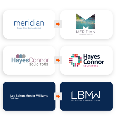
After a consultancy, Hayes Connor devised a brief for us: “to create a fresh new brand that reflected the successful firm they had now become. Dynamic, distinctive and professional, retaining the fun and energy that was evident within the team.” Their current branding was a stopgap that did not reflect the culture and ability that Hayes Connor had cultivated in the five years that it had been active.
The logo’s transformation was spectacular. From a forgettable logo reminiscent of a back-alley estate agent to a distinctive, colourful icon accompanied by a bold font, Hayes Connor’s rebrand is certainly representative of the professionalism of their firm.
Hayes Connor’s logo revamp has accompanied their development as a firm and has contributed to their success today. It ties into the sleek, functional website we developed for them, helping to establish a robust brand identity that conveys dynamism, energy and results. The bold colours used in the logo were used in the website to correspond to various areas of expertise that Hayes Connor offers, helping to reinforce the connection between the new logo and their modern professional identity.
Check out their website here to look at the work we’ve done for them and to read some client testimonials proving their expertise.

